Announcing the Contest Winner!
Earlier This Year
equally, vote that way by saying what you think. Enter your votes as a
comment below.
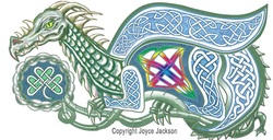
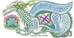
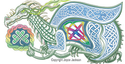
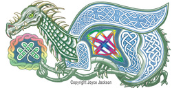
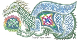
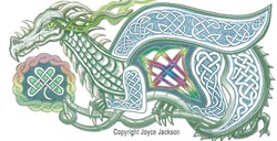
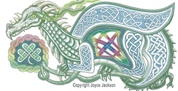
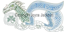
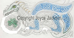
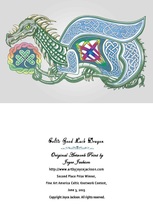
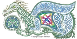
Announcing the Contest Winner! Congratulations to the winner of this contest, Phyllis Harris!! You will receive a copy of this card in the mail in a few days. Blank on the inside. Back has text shown on bottom - minus the copyright notice, which I forgot until after I printed it. You can tell eveyone I said so, Phyllis. I'm sure they're interested. ;) The picture is actually printed upside down, not how it's shown to allow for it being center folded. Ya-a-a-ay, Phyllis! I hope you'll like it. Thank you for your contribution to helping me get the final version of this finished. I listened to your opinion. I needed another set of eyes to take a fresh look at it and you very nicely responded. And it won Second Prize at the Fine Art America contest yesterday, June 3, 2013. So now you can tell that to whomever you'd like, too. Maybe that's a little more interesting. Let's hope so. :)) Here's the info on the contest where it won the prize. Earlier This Year This contest was announced in April on my Facebook page. This is what people who came here from my Facebook page saw: Vote and win a prize. Open to all. Randomly selected winner gets a free blank note card with a picture of this dragon on it. All you have to do is leave a comment saying which version of these is your favorite and why. Vote for which one you like best. Vote by number. If you like more than one equally, vote that way by saying what you think. Enter your votes as a comment below. 7) This and the next one were added a day later. I think I like this the best. It's always good to look away for awhile. I took out the rainbow colors in the shamrock. I seemed too busy this AM with the rainbow in it in addition to being in the dragon's belly. I always see the overall appearance better when I break for a day or more and get a fresh look. 8) Everything's the same as #7, except 2 changes. Lighter color and reticulation, aka, it looks speckled. Same as #2, except heavier eye feature. Same as #1, except lighter eye feature No Eye Feature, Stronger Colors Than #4. No Eye Feature, Lighter Colors than #3 Reticulated, i.e., it looks like it's speckled. Same as #6, except heavier, or stronger colors. Same as #5, except paler colors.
4 Comments
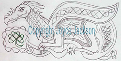
Latest picture Changes after making smooth curves in Photoshop. Something I had to learn. Not very easy to do in Photoshop, but worth the trouble finding out. Using the Tursion tablet (essentially the same as the Monoprice tablet) to sketch has been a great asset. The jitter is a little bit of a challenge, even with it set to 0% in Photoship. One artist said this is the main difference between high-price Wacoms and the lower priced tablets. He said he can't draw straight lines without getting a little too much jitter using the Monoprice tablet. But someone else said they gave away their Wacom and only use their inexpensive Monoprice tablet because they like it so much. Who to believe? I don't know, but for now, this is good enough and I still love it! This started as a crude sketch, my first entry in Ellen Million's Sketch Fest. It still needs a lot of work. I colored it in somewhat with colored pencils. Creating the knots and making the over and under weave appearance takes time. Since working on this entirely in Photoshop, I've developed the knotwork for the legs and wing. I've sponged in some colors and reduced the size of the shamrock. I'll erase out the graphite gray background, although I do kind of like the gray. I might put it back in or keep it in some areas. Wherever it was erased, the white background shows through. More is still to be done on other areas as I proceed.
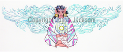
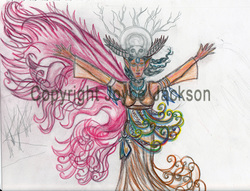
Bank Check ArtworkAny of the artwork here can be made into a print, greeting card, or ACEO. Just send a request. Pricing will be the same as for all my other artwork. Indian Fairy 1 A sample of my Works in Progress - WIP's. Everything is hand drawn with pencils, working from my imagination. Produced on paper with graphite and colored pencil, then photographed and edited in Photoshop. I might give her a raven to hold instead of the crystal and Light circle. Still thinking it over. This is part of a series of Fairies that will illustrate bank checks. They will be sold by a company that produces and sells checks. Details coming soon. Indian Fairy 2 A rough graphite and colored pencil sketch of my second work in the Indian Fairy series for artist illustrated bank checks. I kind of like the look with only one wing. But I'll add the other one. It's just a matter of being satisfied with how this one looks, then reversing it to make the one for the other side. Adh Mór Dragun A very early stage of what will be the first dragon in my Dragons series for artwork on bank checks. Much refining still to do. This is the result after I entered it in the Ellen Million Sketch Fest today. Only one hour is allowed for artists to create a sketch based on a Prompt someone posts. The Prompt for this was Celtic Dragon. Thus the name, Adh Mór Dragun which are the pieced-together Celtic words for "Good Luck Dragon". A nice way to celebrate St. Patrick's day. I'm looking forward to receiving my first tablet for drawing and graphics. I ordered it last week and expect it to arrive next week. Crossing my fingers that installation of the driver goes well and that there won't be any compatibility issues with my computer and software. If it all comes together nicely, I know I'll enjoy how much it will speed up my creatiion process without sacrificing the originality of all my non-sculptural artwork.
My approach to artwork as a source of healing has just been published as an article on 1stAngel Arts Magazine's blog. This is an internet arts magazine headed by artist/author, 1stAngel editor and founder Elizabeth Edwards. 1stAngel has attracted a large following not only in the UK, but internationally, due to Beth's dedication to spreading the word about the arts globally. See the full article here.
I used my dragon as an example of my artwork, but my philosophy as detailed in the article applies to everything I create. I always feel better the next day after spending a large portion of my time immersed in creating artwork. Sometimes it's a challenge juggling life with the "Work", but I've been blessed that no matter what else happens, nothing ever really interferes with my drive to create. I move between mediums. During different phases, I might paint pictures on canvas, create 3D objects of clay, design and make wire wrapped jewelry, or study and practice at some new medium which captivates me. This keeps the flow of creative inspiration fresh. Ideas flood my mind faster than I'm able to carry them out. I keep many sketches and notes so that when a new block of time arrives, I can refer to my records if I need help deciding which creative direction to take next. About Beth Edwards of 1stAngel Arts MagazineElizabeth Edwards, or Beth Edwards, as she's known to those of us happy to be among her many friends, is a very gifted artist. She has been a respected leader in the field of internet arts promotion for many years. 1stAngel was recently cited as one of the United Kingdom's top Arts information resources. Its main function is to connect artists and people interested in the arts. Its content is very diverse and entertaining. In it, you will see "News, Reviews, Interviews", pictures of artwork, artist biographies, and articles on a wide range of subjects. Here is 1stAngel's Facebook page. Beth has been a very active member of Fine Art America's (FAA's) website for many years. Her deep commitment as a moderator on the FAA forum eventually led to her securing a post on FAA's professional technical support team, where she currently serves all visitors to the website.
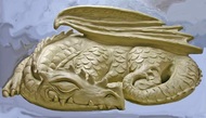
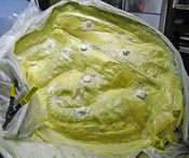
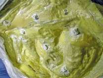
Final Bump-Outs Layer Here's how the last layer of latex on this section looks. I'll have to start over with the next, hopefully final, mold section on the other side of the dragon after I create a plaster Forton mother mold for this section. It will provide the rigidity needed so that the dragon won't collapse and lose its shape when concrete casting material is packed into the mold. Latex can't do this on its own. It needs this support. It had a rough childhood - in the jungle, no less - and is very insecure. Bump-Outs Close-up For those of you who haven't already seen enough, here's a close-up featuring the bump-outs, for lack of a better name. They're not quite buttons, but are often referred to as such. However I need to distinguish them in my mind from the concave buttons I already made on the partition wall. I've been calling them "bumps" when I'm by myself. No harm in it. We all need to have our little talks with ourselves now and then where we can use pet names for things and no one can protest. Watch for my new e-book coming out after project's completion to find out what you need to know about making bump-outs. Wet, uncured areas, shown especially around the bumps are white. The color of latex changes to yellowish as it cures. Most people don't find it appealing. That's good! Otherwise, maybe there would be more widespread reports from hospital emergency rooms treating people crazy enough to bake it into brownies and eat it or smoke it outright. The life of artists can get lonely. Can we blame them that in the depth of their despair, they resort to eating and smoking things most people have the sense not to touch? Further discussion of how to speed up curing will appear in my e-book.
|
Joyce JacksonMultimedia artist in clay, paint, and jewelry. Part-time online bookseller. Archives
November 2018
Categories
All
|